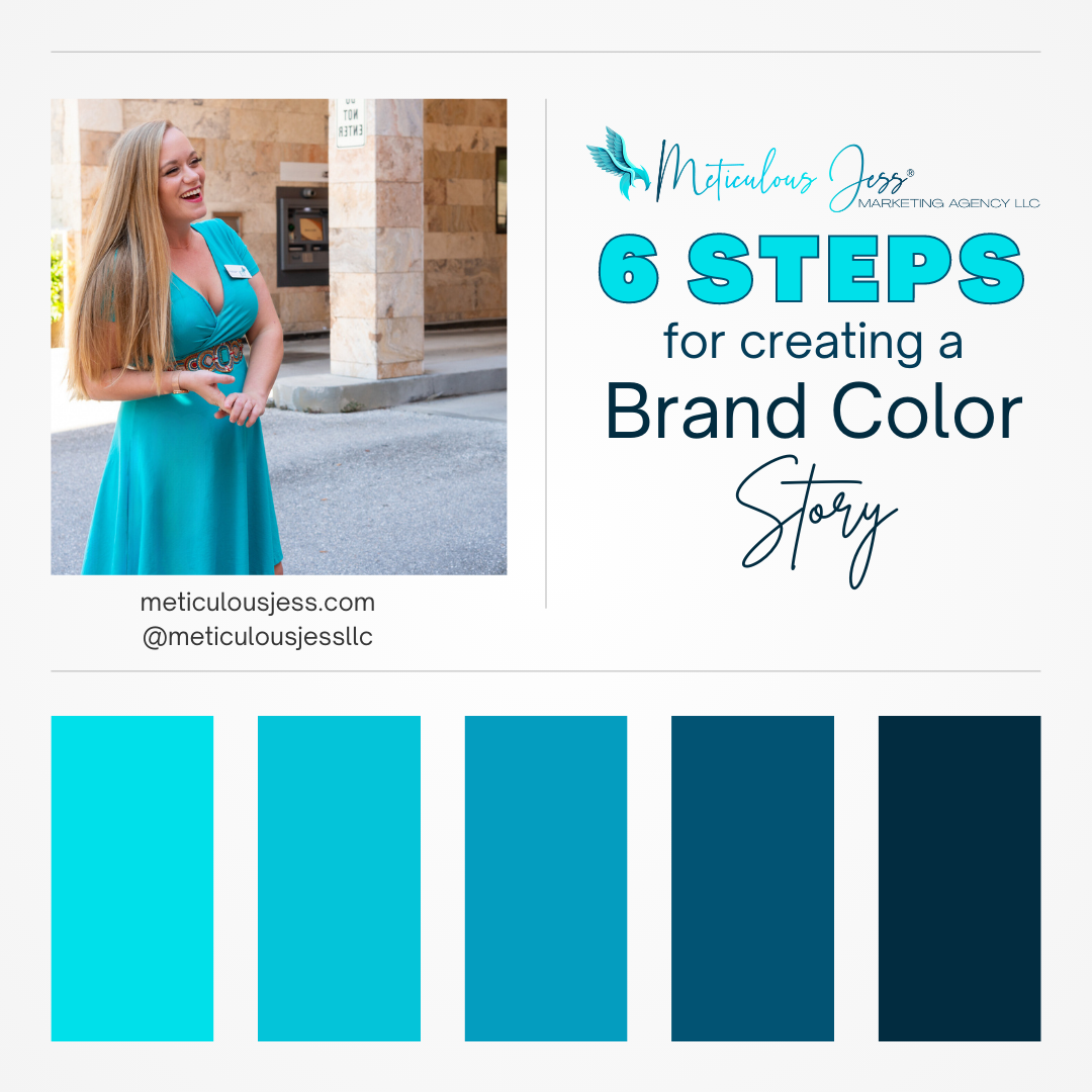
The 6 Steps to Take to Create a Brand Color Story
Learn more by reading below!
When creating a strong brand, color plays a crucial role in establishing a brand identity that resonates with your audience. Colors evoke emotions and can convey a brand’s personality, values, and message. Developing a color brand story is essential to creating a visual identity that accurately represents your brand. Here are some steps you can take to create a compelling color brand story that captures your brand’s essence.
1. Define your brand’s personality and values.
Before selecting colors for your brand, it’s essential to have a clear understanding of your brand’s personality and values. Consider what your brand represents and how you want it to be perceived by your audience. This will help you select colors that accurately reflect your brand’s identity and messaging.
2. Research color psychology.
Color psychology is the study of how colors affect human behavior and emotions. Understanding the emotions and associations that different colors evoke can help you select colors that align with your brand’s messaging and tone. For example, blue is often associated with trust and reliability, while green is associated with growth and nature. We have a blog post coming next week to discuss color psychology in more detail.
3. Consider your target audience.
Your brand’s colors should appeal to your target audience. Consider your audience’s age, gender, cultural background, and other demographic factors when selecting colors. Different colors can have different meanings in different cultures, so it’s essential to choose colors that will be well-received by your target audience.
4. Choose a color palette.
Once you’ve defined your brand’s personality, values, and target audience, it’s time to select a color palette. Your brand color story should include a primary color, secondary color, and accent colors. A primary color is the dominant color in your brand’s visual identity, while secondary colors are used to complement the primary color. Accent colors are used sparingly to add visual interest and contrast. Keep in mind how they will look on a website as headings, sub-headings, and body text. Also consider factors like the background color you plan on using, what types of images and content you will use to coordinate, how they contrast, if they’re easy to read, etc. to ensure that your brand always stands out.
5. Test your colors.
Once you’ve selected a brand color story, it’s essential to test your colors across different platforms and mediums. Colors can look different on a computer screen, a mobile device, and in print, so it’s important to make sure your colors look consistent and accurate across all channels.
6. Create a color brand story.
Once you are happy with your brand color story, you can start using it to create a compelling color brand story that accurately represents your brand’s identity and messaging. Your color brand story should include information about the emotions and associations that your colors evoke, as well as how they relate to your brand’s personality and values.
In conclusion, creating a compelling color brand story is essential to establishing a strong visual identity that accurately represents your brand. By defining your brand’s personality and values, researching color psychology, considering your target audience, selecting a color palette, testing your colors, and creating a color brand story, you can create a visual identity that resonates with your audience and helps establish a strong brand presence.
The Story Behind Our Brand Color Story:
I have a deep understanding of color psychology and how colors impact the way people feel and sometimes, even their behavior. However, my choice in my brand color story was purely emotional. I have always loved shades of blue and green and have been drawn towards nature, particularly the water. I always admire how the water changes colors based on the sky’s “mood”, but somehow always looks beautiful. Most of my closet and the entirety of my home is covered in the colors seen on my website. I always knew that my brand color story would be inspired by the peace I feel when I am surrounded by these shades of blue and green.
Once I opened my marketing business in 2020 and had to create my first-ever marketing materials, my logo was different but the colors have always been the same. My decision to choose aqua and teal colors was only further affirmed by my understanding of color psychology and by performing the other steps mentioned above.
If you need help refining or creating your own brand color story, please click the button below to get started!


